Sense Awakening
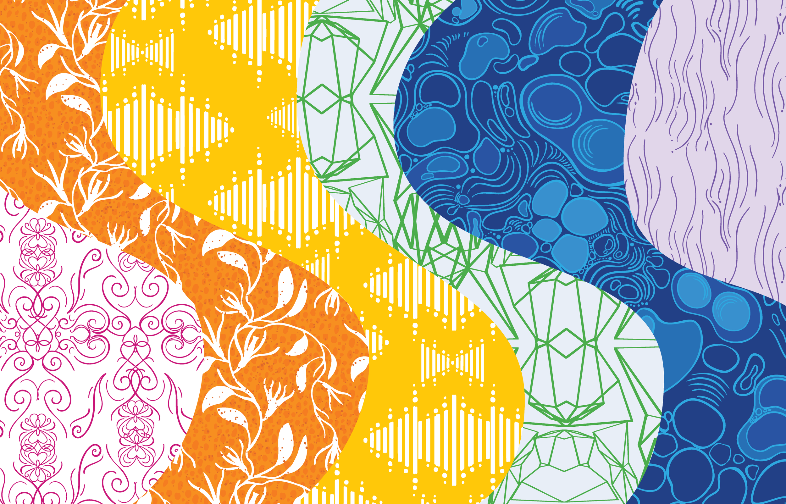
"Sense Awakening" is a site-responsive art installation representing the human senses. Constructed from textile, light, and paint, it explores the layered nature of perception—from internal awareness to external sensation. Rooted in hope for the future, the piece reflects on how we process the world through our senses, shaping our interactions with ourselves, our surroundings, and other living beings.
-
This layer represents interoception, the sense of internal awareness—heartbeat, breath, hunger, thirst, temperature, pain. The color reflects intensity, warmth, and the deep connection we have with our own bodies. This layer reminds us that perception starts from within, forming the foundation of all other senses.

-
This layer represents sight, the sense that interprets light, shadow, and color. Green is the color human eyes are most sensitive to, we perceive more shades of green than any other color. Spending time in green environments has been shown to promote relaxation (as measured by reduced heart rate)

-
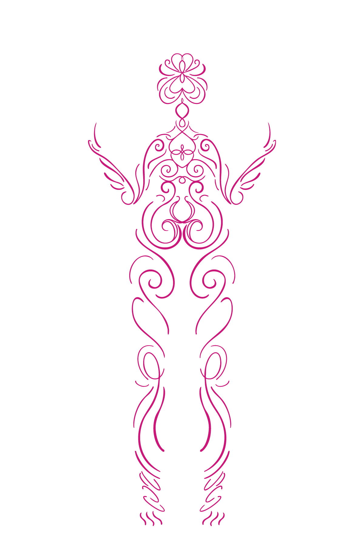
This layer depicts smell and taste, two senses closely linked to memory and emotion. Orange represents energy, appetite, and warmth, evoking the richness of flavors and scents that shape our connection to comfort. This pattern features vanilla orchid plants—vanilla being reported the most universally enjoyed flavor and scent.
-
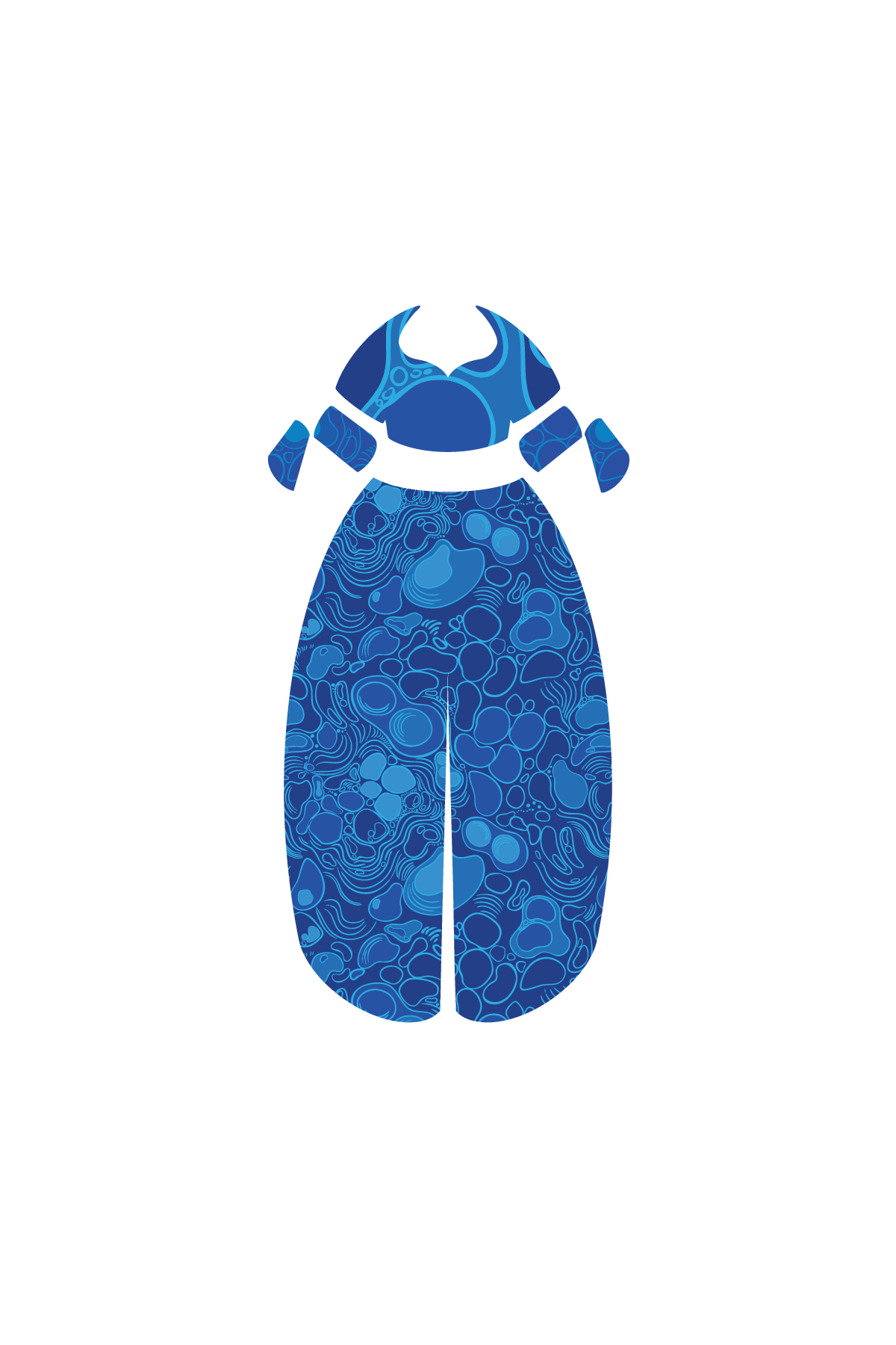
This layer embodies touch, the sense that most directly connects us with the world and others. Blue references water, as skin is about 64% water by weight. Skin is both the sense organ and the surface most often touched by people.

-
This layer focuses on hearing, the sense that allows us to experience sound, language, and music. Yellow, a color often associated with the element of air, represents the way sound waves travel through our environment to reach our hearing systems.
-
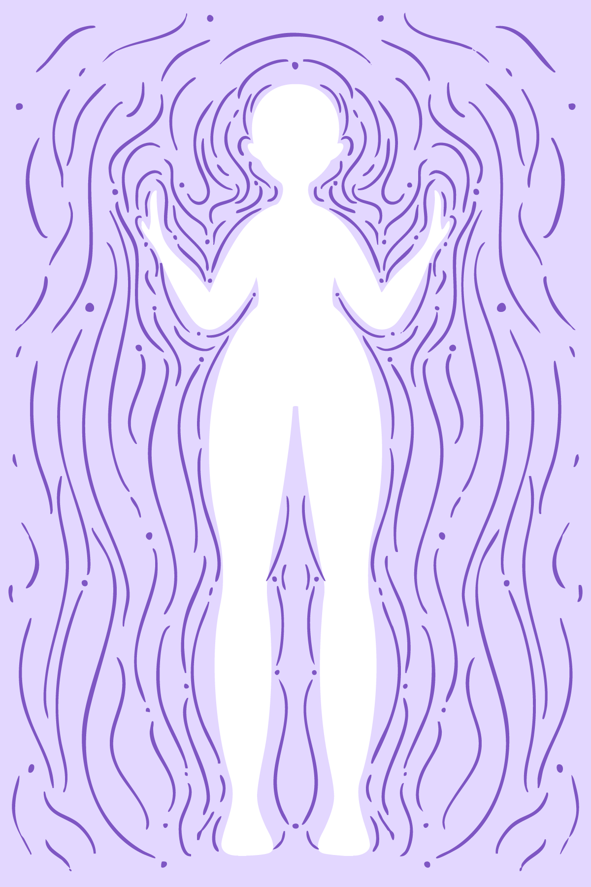
The last layer is proprioception, our sense of body awareness, position, and movement in space. It allows us to move, balance, and navigate our surroundings without needing to look. Lilac, a color associated with intuition, reflects the subtle role this system plays in helping us sense our place in our environment.
*SPECIAL THANKS FOR SUPPORT WITH THIS PROJECT TO: Caitlin, Jon, and baby J. I couldn’t have done it without you